We're observing an increased interest in Information Architecture (I.A.) with a number of clients asking us to perform strategic reviews of their digital products and support them in understanding the future of I.A. It’s an interesting topic that’s coming up more and more, especially with larger, long-lived organisations.
This focus on I.A. is especially intriguing in light of Information Architects being effectively replaced by UX Designers. Maybe organisations are finding their website or digital experiences feel bloated or confusing in spite of their focus on experience, maybe they want to push into new markets or are undergoing some sort of ‘tidy up’. Whatever the reason, taking a look at your I.A. sounds like a good idea, but where do we start?
What is Information Architecture?
Ever since people first started writing down information we needed a way of finding it again. The ancient Sumerians created archives of clay tablets over 4,000 years ago and since then the organisation of these resources has been an important part of record keeping. Today, with massive amounts of information being stored every day, organising our data is more important than ever.
If you asked a System Design expert in the 80’s about I.A. they would have talked about structure, behaviour and views of a system, but how that relates to modern digital design is still debated. The confusion seems to revolve around the point where organising information merges into displaying information. In the early 90’s Richard Wurman was instrumental in applying I.A. to our digital landscape and with the definitive guide - Information Architecture for the web and beyond - first produced in the late 90’s, it may have looked like I.A. was going mainstream.
A working definition of IA
With origins in System Design and a large crossover with the new world of UX, a practical definition of IA in the context of our digital world would be very useful. A good place to start might be:
...I.A. results in a structure that makes sense and is easy to navigate
An interesting conclusion from this is that IA is not the structure, it results in the structure. That means IA is a process. This calls into question our original brief to review an IA. Auditing a process that was probably undocumented and undertaken in an ad-hoc manner a long time ago is not easy and probably not very useful, but reviewing the results of that process is something we can do now.
At a glance, it is easy to see a navigation structure in most websites and we can start to derive insight from this, but having a framework for questioning would help.
The three parts of Information Architecture
1. Identify the things
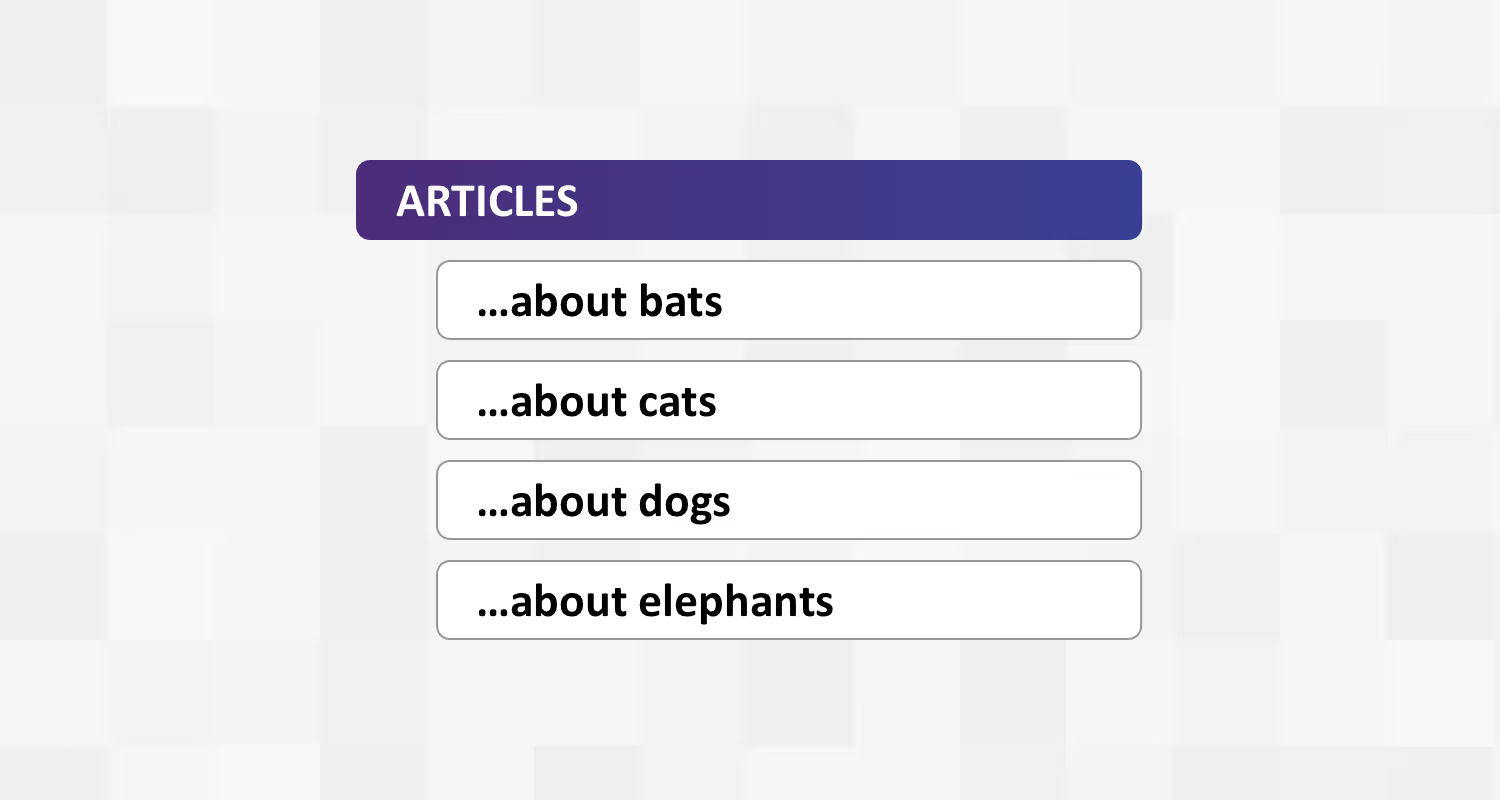
Sometimes referred to as ontology, this part of the I.A. process would have defined the things that make up the content of a website, eg: a blog style site may have Articles and Authors. Where ontology gets interesting is that things of one type often have relationships with things of another type: eg, an Article has an Author.

A website’s complexity can often be found in the multitude of relationships between things, such as:
- An Article has multiple Authors
- Authors have multitudes of Articles
- An Author may like an Article from a different Author, who has written many Articles...
When defining the structure of a website, ask:“What are the things and how do they relate?”
2. Organise the things
Probably the most obvious part of I.A. is looking at the structures these things are classified into, often referred to as taxonomy. It is relatively straightforward to group content into useful categories to create something like a site map and there are many effective tools and techniques available to help.

There are several interesting things about I.A. that it would be good to keep in mind:
Informed by ontology
The things may predetermine or inform a taxonomy, eg: If one of your things is an Article there will need to be somewhere to find them (lists), a system grouping them (topics), ways of filtering articles (eg: date) etc. You will not be classifying articles by, say, the number of the letter ‘e’ in each one, so good I.A. would result in a structure that would be practical and valuable for the intended audience.
Poly-hierarchy
There may be a case for a thing to be in two places at once. Labelled Poly-Hierarchy it is a powerful tool for creating flexible structures and serving the right information to an audience when and where they are looking for it. The downside of poly-hierarchy is complexity so sometimes giving a thing a single fixed home makes it very easy to find a second time.
Relationships
Don't forget the relationships! Things naturally inherit organisation from the way they relate to other things. These relationships do not necessarily need to be fully exposed in a taxonomy but being aware of them is a powerful tool. Eg: Organising Articles by Author is very valid.
When organising a site, ask: “How do I organise these things so they make sense?”
3. Find a thing
The third part of IA is where the process blurs into UX. Given things and ways of organising those things, what's left to define is how our audience navigates to, or finds something they want. Sometimes called choreography this is the part of IA where we might look at a site’s navigation system, the interaction models, search systems etc. Some things to keep in mind when looking at choreography:
It’s not just about menus
A large, static menu structure is one way to help an audience find something but not the only way. Being aware of how one piece of content can lead to another allows the creation of productive journeys through the site.
Nouns vs Verbs
Thinking about journeys starting with a noun (eg: “Savings Accounts”) versus a verb (“Start saving”) can twist the whole structure of a site leading to a re-imagining of how a site educates its audience. Nouns are factual and fast, verbs are great for curated journeys but mixing up nouns and verbs in the same menu can be confusing.
Storytelling
Storytelling can be a very powerful way to get a message across, educate or lead an audience on a journey through a site. If the ontology and taxonomy allow, clever choreography can lead an audience along story paths that make their time on a website beneficial.

How a website enables its audience to find things, whether through factual nouns or verb based storytelling, can greatly affect how the I.A. process deals with defining and structuring the things. Put simply, it is sometimes good to start with a choreography strategy rather than build a menu at the end.
When designing an interaction framework, ask: "How will my audience find things?"
Where does I.A. fit in?
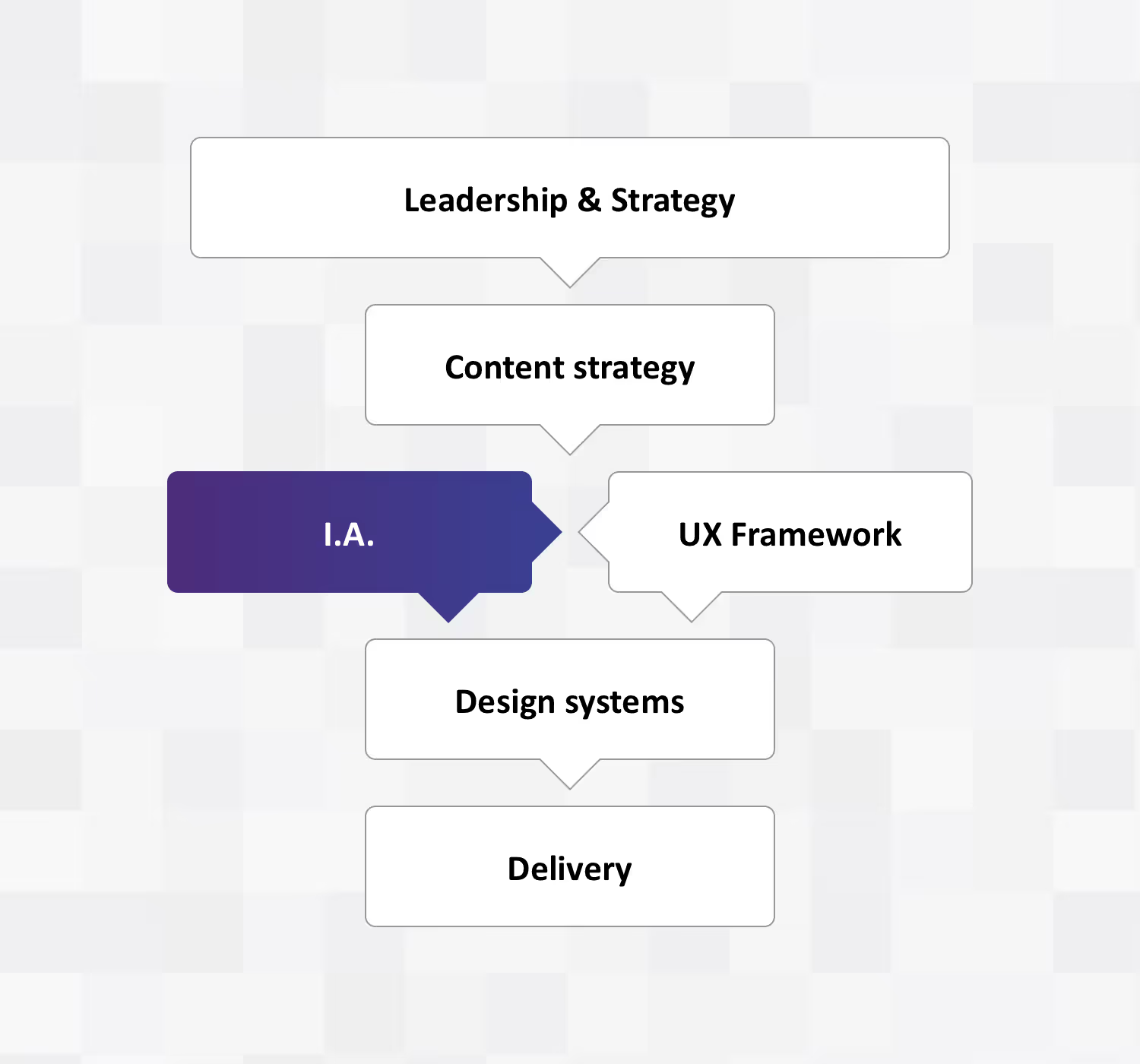
Information Architecture can be so much more than merely the design of a few menus. I.A. is an enabler of a strong content strategy, it builds on the requirements derived from business marketing and customer strategies and informs the development of solid UX frameworks. The outputs of a good I.A. process inform the development of a useful Design System and can be used as a resource for appropriate technical architecture.

Any conscious look at a website’s ontology, taxonomy and choreography will have value. Any new understanding of how an audience moves about the information landscape is knowledge that can lead to insight and positive change. “Shuffling the pack” - reorganising the content, redesigning navigation but leaving the content untouched - will also have value, especially if done in tandem with UX research.
If the goal is a comprehensive shift in content strategy it is good to note that a holistic I.A. process is led from the strategy and informs delivery. This is a big task that needs the backing of the whole organisation. Of the content that exists, some will be kept, some rewritten and some discarded. New content will need to be produced and technical and delivery systems may need to adapt. Throughout all of this, it is good to keep in mind that Information Architecture is a process, it is an important part of shaping a web presence and is integral in enabling and delivering on an organisation’s strategic objectives.


